Monday, 14 April 2014
Evaluation question six
What have you learnt about technologies from the process of constructing this product?
During the process of creating my magazine, I have used a range of technologies, both online based and computer programs, also I used some physical bits of kit.
Firstly, of course, I used blogger to display my preliminary task, planning of my music magazine and my final magazine. It is a useful tool as I can look back at my posts in chronological order and make changes if necessary. I have learnt how to blog successfully and to embed files (such as prezis/slideshares) using the HTML tool, it also enabled me to upload all of my work onto a format that is creative and fun to use.

I have used prezi quite a lot in my planning stages, it's been useful on posts such as the construction process of my magazines as it has many types of text boxes and the information can flow freely around the prezi, so it's useful for a step by step process. I also used it to create mind maps on how I created my masthead name and they typical conventions for a rock magazine. The format made it easy for viewers to pan and zoom freely.

I used various slide presenting websites that allowed me to upload power-points and to embed them onto my blog. Firstly, the most well known, Slide-share was good in the sense that it was easy to use and embed onto my blog, however I needed a dropbox account to upload, so yet another password to remember.....I then used reel for my magazine plan, It was useful as viewers could rate my presentation either up or down, it was very useful as no signup was required. I also used slide snack and projeqt which were very similar as I could design slides on the website, I used them for my album cover process and fonts post.

One of the main pieces of hardware I used was a Nikon d3200 camera for my main photoshoot, it produced high quality images and the manual focus really helped me get complete control of my images. I did find it harder to use than a regular compact because I have no experience with proper dlsr cameras, however my friend ran me through the basics of the manual focus and the gridlines to keep my images in key with the rule of thirds. I learnt that using a handheld camera enabled me to get more control rather than just using a tripod, it gives my images a realistic and unique quality.
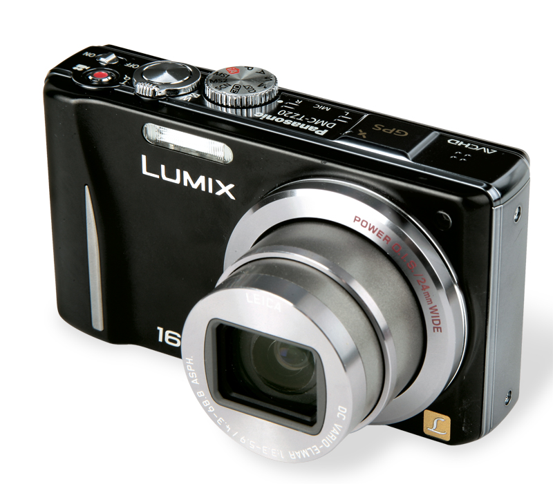
I also used my own compact camera the lumix DMC-TZ20 which I used for my secondary images as they were both on location, so the camera needed to be small and lightweight. The 16x zoom helped me get detailed and quality images for my secondary photos. Taking photos and uploading them was easy as I could mail them directly from the camera to my address, also I am more used to compact cameras as they are more simple to use and cheaper.

In tems of social networking, I used a few websites to moodboard my ideas. For example Polyvore is a community based social commerce website where members create 'sets' based around portraying fashion, craft of interior design videos using a database of shared images, It was very useful for creating moodboards in a creative way as I could use a wide range of fonts and templates. Also, I used Pinterest, which is a visual discovery tool that users use to collect ideas for their various projects, interests and ideas. People create and share collections (called “boards”) of visual bookmarks (called “Pins”), I used it for my photoshoot and magazine layout boards as a vast amount of high quality 'pins' could be used to quickly 'brainstorm' some initial thoughts, it could also be embedded onto my blog.

I used murally to display my model profiles and album cover name ideas, Murally allows you to save text, images and videos on a mural style notice board so you can organize your ideas, It was very easy to use and my ideas could be embedded onto my blog for easy navigation.
Also, I used glogster edu, it is tool that lets you create interactive posters through the use of text, sound, images and videos, it was useful for my evaluation question four as I could be creative with my response.


For all of my computer work, I used the hardware school imac computers, they have a large, high resolution screen to enable me to clearly see my editing and construction processes, Also they are very reliable and fast, meaning I could get my work done quickly. I didn't use the mac operating system, I used windows 7 operating system on their as I feel I know more about it and I am more used to it. In the future I will use the mac operating system to make use of it's full potential. I have mainly used it for editing as I don't have the software at home. At home I used my lenovo 7781 hardware computor, it has a very powerful and fast processor so I did most of my blogging at home, I didn't really learn about it as I use it a lot for work, and it runs on windows 7 which I have experience of.

For creating my magazine I used the software Adobe fireworks, it allowed me to construct it with ease as their was no layering so I could simply click and drag to change my magazine. It was easy to add images and text. I didnt know much about it before, only how to create rollover buttons, but with the help from simple guides on the adobe website, I have mastered how to use it. I also learnt how to use photo editing software Photoshop to edit all of my images before I added them to my fireworks document. I have learnt how to naturally achieve an airbursh finish by using the clone and healing tool, however I found some elements difficult to use such as the idea of the 'layers', this is why I created my magazine on fireworks instead.

I found scribd really useful for my evaluation question one, I learnt how to upload word documents into pdfs onto the site then to embed the code onto my blog, it allows the viewer to scroll down the pages to read in chronological order.

For one of my evaluation questions I used podsnack to embed my sound file onto my blog, I learnt how to use it through a quick guide on the website and within a matter of minutes it was up on my blog. I learnt how to record my voice in the first place on the voicerecord pro app available on the apple app store, I learnt how to convert it to MP3 then to uplead it to podsnack. As I have learnt all of these skills, I feel I can make use of it more by making playlists and podcasts.
Sunday, 13 April 2014
Saturday, 12 April 2014
Friday, 11 April 2014
Thursday, 10 April 2014
My final front cover and the changes I have made
I have made a few changes to my front cover due to the feedback I received from my teacher.

Firstly, my teacher said that the box out was too big on the article "GREAT YEAR, GREAT ALBUMS", I used the scale tool on fireworks to re size the white box out so it wraps the text more closely, therefore minimising unnecessary white spaces. However, because the first line of the secondary covered less pixels in width than the line below, a gap was left on the boxout, I didnt want to resize the text itself using the scale tool as the I was happy with the size already, because it was legible and eyecatching. I first tried to include an asterisk in the gap to guide the reader where the text is, from my research it worked well on company magazine, I used the brush tool with a hard rounded black line to roughly draw the shape for a scribbled effect, however it did not look right on my cover and made it look messy. Instead I used the text tool to add "2013" in a size 13 calibri bold font, I used the scale tool to rotate it so it was adjacent to the secondary lead "GREAT YEAR" this acts as a pull to draw the readers attention to what the articles about.
Wednesday, 9 April 2014
My final contents page and the changes I have made
I have changed my contents page slightly using fireworks, taking on board the feedback my teacher gave me.

I have made a few small changes to my contents page, Firstly I added a web address to the top of the page as it is in the readers direct eye-line, I used the text tool with the easy to read calibri font to create my web address, to emphasize it, I changed the colour of 'bassline' to a magenta that highlights it a links to the colour scheme. The reason I added a web address was to attract a younger audience who want to explore the magazine further online, the website will provide more information about the magazine and more exclusive articles and competitions. Also I added credits to the editors letter using the text tool to show who the editor is rather than just having a signature.
My final double page spread and the changes I have made
This my final DPS, I have changed it slightly due to getting some feedback from my teacher.

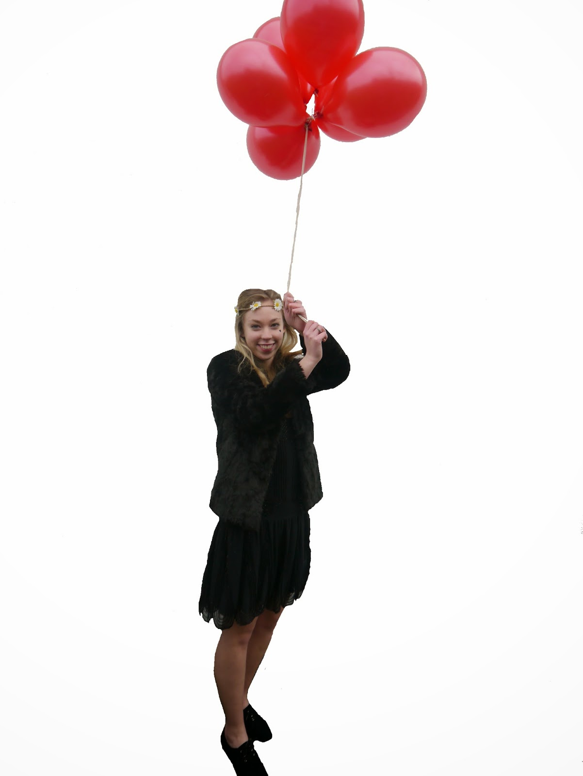
Firstly, I added credits onto the main image to state the writer and the photographer (obviously I took the photos!), I used the text tool and italicized the credit headers 'words/pictures' so they stand out and look more professional. I also changed the type and layout of my column of secondary images, For example the image sizes were mismatched, so I changed them so it alternated between landscape and portrait to keep it looking professional. Also, I changed two of the images, I added an extreme closeup portrait image as I felt my double page spread lacked a variety of angles, I used the scale tool to re-size it so all of the images were aligned. I then changed the image with the red balloons as they looked out of place, also the angle was not completely straight and the image quality wasn't brilliant. So I changed the image to a long-shot with a highly contrasting background and a better image quality. Also, I added filters to the three landscape images to add interest and an to emphasize they alternate with the portrait images which are in full colour. I added the black and white filters using pic monkey.com.
Tuesday, 8 April 2014
Sunday, 6 April 2014
What mise-en-scene did I use? Lighiting and location
I have used a google drawing from google docs to show how I chose my locations and lighting, To view it better, it's best to zoom in on the screen. 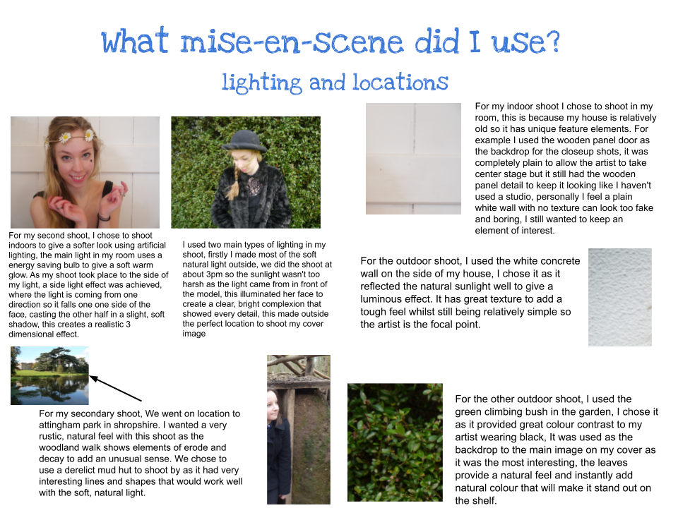
Thursday, 3 April 2014
Tuesday, 1 April 2014
Why I chose my mise-en-scene: Costume and props
My mise-en-scene played an important role in the development of my photo shoot and my artists identity. I have created a Google doc image to show my mise-en-scene and the reasons I chose each element. To see the text, it's best to zoom in on the screen to about 175%.
Monday, 31 March 2014
What fonts did i chose and why ?
I have created a slide snack presentation to portray what fonts I chose to use for my music magazine and why.
Wednesday, 19 March 2014
My Final double page spread

Main image: My main image is part of my main photo-shoot for my main artist, it's the largest image on the page, therefore it's the main focus. I chose to use a medium close up eye level shot from the waist up so most of the artist can be seen, I also chose the image because it has lots of background space, this allowed me to overlay the headline and the text box without the image being obscured.
Fonts: The fonts I have used were sourced from DAFONTS, I used the font 'always here' for the headline as it adds a quirky edge, linking to my alternative genre of my magazine. I also used it for the quote in a bright blue color to link to my magazines chosen color scheme and to make it stand out, as it was the same font they anchor each other together to make a direct link to the article. For the text itself, I used Calibri font for the main interview as it is easy to read.
Text layout: The text layout is in columns so it gives the impression of a continuous interview, the byline to the headline is located in the white box out and introduces the article, it is also underlined to show its where the article starts. For the questions of the interview they are highlighted in the same blue color as the quote with white text over the top, thus providing better navigation for the audience as the questions act as text markers.
Headline:
The headline is located at the top of the mage, adjacent to the main image. It incorporates the background glitter as a border and the white box out makes the black text stand out, I used a mixture of the rectangular marquee tool and the rectangle vector tool to achieve this look.
The secondary images: The secondary images are on the right hand side in a column format, this created a filmstrip/ photo-booth effect. They are in a variety of different shots such as long/mid shot and a variety of different angles such as eye level and canted. I to took a lot of effort to edit them so they looked neat and aligned, to achieve this I used the pointer tool and vector tool, and if images needed to be cropped I used the rectangular marquee tool. I also added a black and white filter to three of the images so they are mixed up a bit, it creates interest
My final contents page
Here is my final contents page for my music magazine, I created it on Fireworks.

Images: The images I have used represent how important the corresponding article is, therefore the larger the image the more vital the article is. I used a variety of shots including a closeup, med shot and eye level long shot, this adds interest. I edited some of them by cropping away certain areas using the rectangular marquee tool to change it's shape. All three images have captions on them to show the reader which article they belong to.
Text: The text itself is categorized under different sub headings for easy navigation, again I have made up bands and artists for my contents page.I have included a variety of articles to engage the reader, most of them are about current music and promoting new artists into the music scene.
Layout: My contents page layout is in columns for easy navigation, I used the text tool and the group button to move chunks of text easily into place. All of the articles are under different subheadings to categorize them, such as the article "gig discounts" will be under the subheading "every month" this creates easy, no nonsense navigation. The images break up the text for a more relaxed feel. All of the numerical bullet points have a break up line to the right of them so they stand out next the their linking article. I have changed it slightly from the draft as the images and text are located in a different place, I used the pointer and scale tool to do this.
Editors letter: The editors letter adds a personal touch and introduces the magazine to the reader, I used the glitter background from my original glitter image then used the rectangular marquee tool to cut out the best portion of it, then, I added a white box out with a feathered edge so it blends easier and gives a soft gradient effect. The letter itself is in one piece of continuous prose to add flow and a relaxed feel.
Fonts:The fonts I used are bold and unique, I used the same font as the cover masthead for the contents masthead to add a link. The sub headline font is in a handwritten style so it is more noticeable and informal, the contents body itself used the calibri font because it's easy to read.
My Final front cover
So, here it is, my final front cover (although I might change it slightly if I get any feedback). I created it on Adobe FIREWORKS as it's very easy to construct different documents, I could add fonts and images and manipulate them with ease.

Headline: The headline is very bold, so its easy to recognise, I constructed it on fireworks (see previous post) which allowed me to add the 'amp cable' effect running through it, therefore linking to my genre of alternative rock. The colours used are part of my colour scheme, so everything ties well together as the black and white promote colour contrast.
Main image: My main image is a close up/ medium close up angle of my main artist, she is making a form of direct address as she is looking directly into the camera. The image itself links with the colour scheme as the artist is wearing black to contrast the artist from the text . To anchor it to the fact that it's the main article, I highlighted it's importance by overlapping it slightly over the masthead to make it stand out by using a combination of the eraser and magic wand tool. Any small imperfections on the image, were removed using the clone/blur/healing tools on Photoshop.
Fonts:In terms of the fonts, I kept them the same as my draft. The bigger the font, the more important the article, this is proved by the headline being the most bold and colour contrasting. For the rest of the text, I used fonts such as 'brain flower' and 'are you freakin kidding me', sourced from Da fonts, these were in assorted colours like a bold blue or magenta to stick to my colour scheme and to create a sense of a unique magazine. The secondary leads have boxouts under a few of them, this is to make them stand out, I used a white rectangular boxout on the blue/pink fonts by using the rectangular vector tool on fireworks and a blue paint smudge under the 'Brit award' article to add an unusual edge using a size 32 brush on photoshop then copying the image onto the cover .
Text layout: In terms of the text layout, it is different from the first draft. Firstly the headline is on the right rather than the left and the secondary articles are located in a different place. All of the articles 'wrap' round the main image so the face isn't obscured. I shifted and moved the text to my liking using the pointer and scale tool to stick to the rule of thirds, in the sense that the text is located on the left and right hand sides to allow the main image to occupy the middle third.
Headline:The headline is the largest font on the page, so it stands out. I decided to use a font in a rustic brush/handwritten style to make it seem more personal, hence linking to the fact that's it a direct quote from a Q/A format article.
The advertising puff: The advertising puff is located to the left of the page rather than the right like in my draft, I used the glitter box out to link with the glitter used on the contents and double page spread to create unity. I achieved this by using the circular marquee tool to 'cut' out a section from my original glitter image and placed it onto the cover using the pointer tool. I used a different font to anything used on the cover so it stands out and the circular shape catch the readers attention.
The text: The text itself is advertising different articles, rhetorical questions, persuasive tag words ("NEW" "WIN") draw the readers attention to various areas of the cover. I created all of my own bands and artists so my work isn't conformist.
Tuesday, 18 March 2014
Contents page construction process
I have made a prezi that shows my construction process of my final contents page.
Sunday, 16 March 2014
My images, before and after and the changes I made
I have edited my photos in different ways for my magazine, for every photo I used Photoshop as it's the most professional tool for the job.
As an example, I took this photo (sadly I didn't end up using it) and initially used the magic wand tool to remove areas of a similar colour, however this tool removed some elements of the artists feet as her shoes were a similar colour to the gravel. Instead, I chose to undergo the painstaking process of rubbing out the background using the eraser tool as it got the closest and most neat finish, this meant that I could edit the image onto text and the text would wrap round the image.

The second effect I chose was to place a black and white filter over some of my images on the double page spread, this would create an unique effect and deter from the usual full color images in a magazine.

With this image, I decided to crop it into a square shape using the rectangular marquee tool on fireworks to remove certain sections , this would mean it could fit onto my contents page without me resulting to making it smaller so less of the image is seen.


Construction process of my album cover
As an extra for my double page spread, because I had some spare time, I created a quick album cover on fireworks, I have created a mood board on polyvore of covers I like from the alternative genre.

album covers by erinswierdworld on Polyvore
I like these album covers as they are interesting to look at, they all have unique album artwork, for example I took inspiration for the paint brush effect from ed sheerans album '+', I adapted the font style from Blondies 'Parallel lines' to a similar brush effect font on my cover. I also used a similar close up camera angle to the cover of Katie Meluas 'The House' album.
I have also created a Projeqt presentation to show my album cover process.
Construction process of my draft
I have made a slideshare document to show the three step construction process of my magazine. From the hand drawn initial idea to the layout idea on fireworks to the final magazine, I have shown the processes and why I chose a certain layout.
Saturday, 15 March 2014
Photos I didnt use
Here is an ANIMOTO I made of photos I didn't use from my main photo shoot
Images I didn't use for my photoshoot
Images I didn't use for my photoshoot
Friday, 14 March 2014
Thursday, 13 March 2014
action plan so far 2
|
Date
|
Task
|
Completed? Any notes?
|
|
17thDecember
|
To have completed all of my
research, planning, questionnaires, mood board, font ideas, decided on name,
image editing, layout plans and color schemes
|
Completed all questionnaires planning fonts
and mood boards. I still need to focus on layout plans.
|
|
21STDecember
|
To have completed mock
photo-shoot, draft ideas on blog
|
I haven’t been able to do any photo
shoots due to my model being unavailable, also I will make sure I do my
layout ideas/colors/fonts and analysis within the next few weeks. Probably
by 10th Feb.
|
|
24thFebruary
|
To have completed my draft
magazine along with real photo-shoot, feedback and how I will change my draft
to the real magazine
|
I have done my real photo shoot
and some secondary photos, most of my draft is completed, and I have finished
all of my planning apart from some more analysis and article ideas.
|
|
17th march
|
To have edited all photos and
nearly finished magazine cover, contents and double page spread
|
I have completed my real photo shoot and all of my secondary images;
I have edited all of my cover/contents and double page spread. I have also
had the time to create an album cover. All article ideas are completed and
photo editing process is shown.
|
|
10th April
|
To have completed my magazine and
all 7 evaluation questions, check blog if any changes are needed
|
|
Wednesday, 12 March 2014
The process of creating my double page spread
I have made a prezi showing the step by step process of creating my double page spread
Monday, 10 March 2014
Spot healing
Here is an example of how I retouched and spot treated my main photo-shoot images, I achieved this by using Adobe Fireworks.
 Firstly, I opened the image onto fireworks and zoomed out to 12% so I could see what bits I needed to change.
 Then, I used the zoom button to zoom to the chosen area at about 50%, this enables me to get a close up view, but to still be able to see the area in relation to the rest of the face.
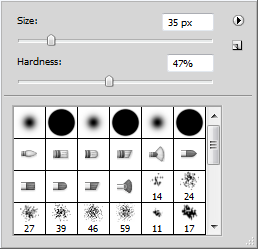 I opted for a clone tool to duplicate certain sections of my image that match in skin tone and texture, I chose to have the brush size at 35 as it is small enough to be detailed, and the hardness at 47% so the clone was still effective but not too harsh.
 Here is the section I have cloned, at the moment the edges are too harsh and it looks even worse than before.


Now I need to use the healing tool to softly blur away the harsh edges to get a soft and natural skin texture.
Here is the finished image after I used this procedure on areas all over the face.
Photo editing
I used photoshop to edit all of my photos, it was useful as I could blur imperfections and remove any marks on clothing.


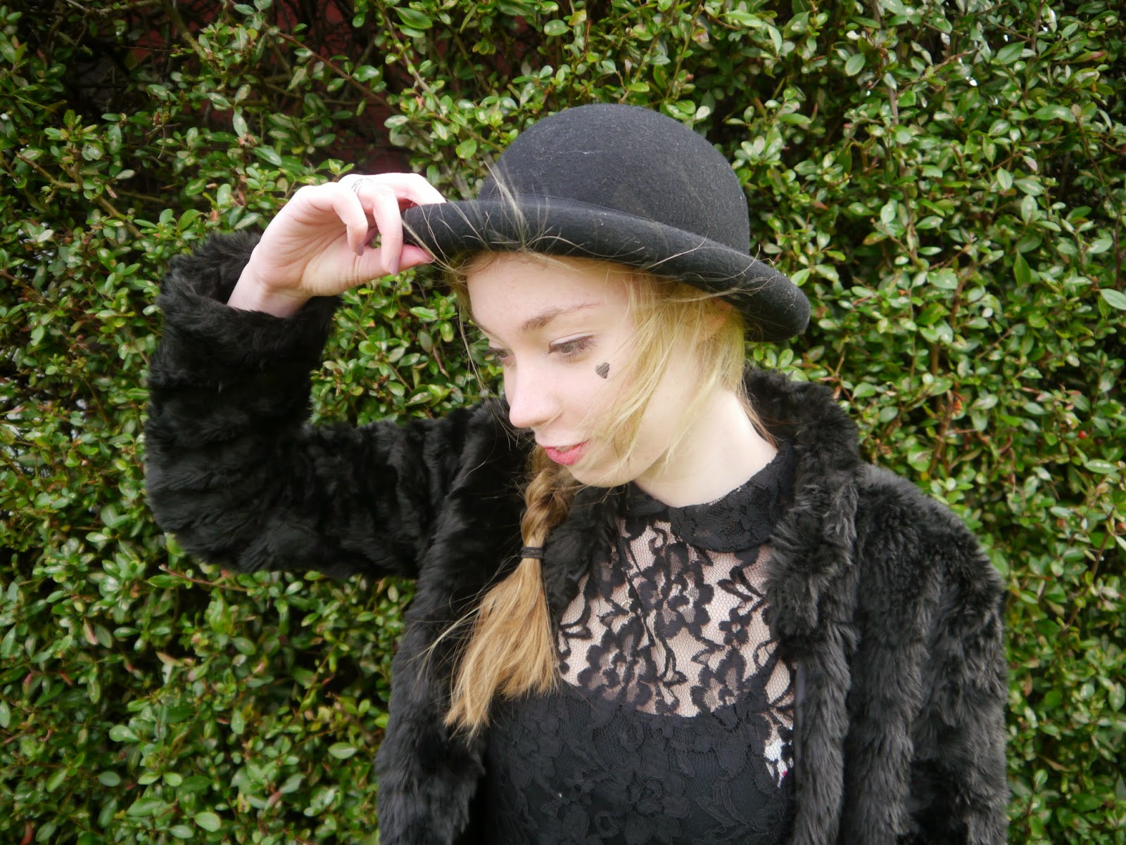
Firstly, I used the clone tool to remove sections of flyaway hair by cloning sections of the hat.
Then, I used the healing tool to blur away any harsh edges that I created with my clone tool
Finally, I zoomed out and used the clone/ healing tool to remove any spots, bits of fluff and flyaways to create a polished photo.
Sunday, 9 March 2014
Friday, 7 March 2014
Magazine article's plan
Headline: "IT'S REALLY PAID OFF"
Main article for the double page spread: HELLO NEWBIE= this infers that she is new to the music industry, and the relaxed language makes the magazine feel more informal
I have used a question answer format to be able to highlight the questions, this format breaks up the text, therefore making it easier to navigate; rather than just formal, continuous prose.
Secondary articles for the cover:
Secondary articles for the contents without pictures:
Main article for the double page spread: HELLO NEWBIE= this infers that she is new to the music industry, and the relaxed language makes the magazine feel more informal
I have used a question answer format to be able to highlight the questions, this format breaks up the text, therefore making it easier to navigate; rather than just formal, continuous prose.
Secondary articles for the cover:
- 'What now?' 'front woman of the Grammy nominated band 'Alignment' goes solo
- " The BRITS 2014"
- "GREAT YEAR, GREAT ALBUMS"
- "The best gigs to come"
- "Kingtown's new release"
- What now" front woman of Alignment goes solo
- Jenna Wreckit's new tour
Secondary articles for the contents without pictures:
- 'Best album of 2013, what do you think?'
- 'The Reading/ Leeds festival hot-list'
- 'Win exclusive tickets to 'THE KEYS'
- 'quickfire questions with The Cons'
- 'BASSLINE chats to Imogen Robins'
- 'apocalipse', shock spilt !!!!!!!'
- 'Will Tom Benson go to NO1 With His debut single ‘Claws’
- Past society’s new EP,
Something new for their fans - Jenna Wreckit's new tour,
She travels the world - DOWNLOADS?
are they destroying music? - BUSKERS
A fresh new breed of artist - The life of a Rock Star,
It’s not all ‘king size tubs’ - Talent shows,
Do they actually help? - Music star turned actor,
Is it for experience or money - Film soundtrack’s
Which is the best? - Acoustic vs Electric
- Albums that defined rock,
The legends live on - What was your first album?
The one you first bought - Compilation’s are killing me
They don't show true potential - Records live on,Vinyl is still strong
- Album artists'
Do they have the best job in the world? - Quiz this
win £100 - BASSLINE mail
The latest music news - Subscriptions
5 issues for the price of 3 - GIG DISCOUNTS
up to 25% off - Album and singles charts
The race to number one
Wednesday, 5 March 2014
Photo plan
Cover
.Solo female "Breaking Beth"
Model/s: one female
Camera angle: medium closeup/ able to see background
Location:in front of a green hedge/
mise-en-scene: black bowler hat/ black clothing/ fur coat
Contents
solo female "Breaking Beth"
Model : one female
Camera angle: medium close up high angle
location: a white outside wall
Mise-en-scene: flower headband/black dress/ ukulele
Solo female front woman of Alignment goes solo= Chloe Williams
Model: one female
Camera angle: eye level mid shot/ able to see surroundings
Location: outside by a ruined 'tree house'
Mise-en-scene: black coat, natural makeup
Solo Female: Jenna Wreckit
Model: one Female
Camera angle: long shot eye level
Location: By a brick wall/ outside
Mise-en-scene: the brick wall/ dark colours for the outfit/possably a bench to sit on
Double page spread
Solo female "Breaking Beth"
Model/s: one female
Camera angle: medium closeup/ long shot / able to see background
Location:in front of a green hedge/
mise-en-scene: black bowler hat/ black clothing/ fur coat
Solo female "Breaking Beth"
Model/s: one female
Camera angle: medium closeup/ able to see background
Location:in front of a green hedge/
mise-en-scene: black bowler hat/ black clothing/ fur coat/ artist looking away from the camera
Solo female "Breaking Beth"
Model/s: one female
Camera angle: long shot with a canted angle able to see background
Location:in front of a green hedge/
mise-en-scene: black bowler hat/ black clothing/ fur coat/ ukulele
Solo female "Breaking Beth"
Model/s: one female
Camera angle: medium closeup/ able to see background
Location: in front of a white wooden door
mise-en-scene: black dress/ floral headband/ black and white filter
Solo female "Breaking Beth"
Model/s: one female
Camera angle: long shot to see background
Location in front of a white wall
mise-en-scene: black dress/ fur coat/ floral headband/ red balloons in a bunch
Solo female "Breaking Beth"
Model/s: one female
Camera angle: close-up of artist
Location:in front of a white door
mise-en-scene: black dress/ floral headband/ black and white filter
Monday, 3 March 2014
My double page spread draft
This is my double page spread draft for my magazine, like my cover and contents I created it on adobe fireworks.

My draft contents page
Here is my initial draft of my contents page, I created it on fireworks so editing it for the final hand it would be easier. Obviously because its an initial draft it will require some changing.

My draft cover
Here is my initial draft cover I created on adobe fireworks, it's my very first draft of my ideas so it may require some tweaking.

Sunday, 2 March 2014
My main artist for my magazine
Due to my model being unavailable, my friend Beth was able to do the shoot last Saturday. The Artists identity:
I want my artist to be an alternative rock singer, this will make a direct link with my magazine genre. I want my artist to have a quirky and unusual identity to add interest to the music industry, this links with their chosen instrument, a ukulele, this is because its an item not often seen in the charts. I want my artists message and identity to be positive and consumer friendly, for example I don't want her to look like Rhianna because it will attract the wrong kind of attention and will lessen the serious note. Hopefully these decisions will attract an audience of 16 to 21 year old's who care about good music, not just image alone.
Name: I have decided to call my artist 'BREAKING BETH', I decided on this as my 'artist' will 'breaking' into the music industry, this creates a sense of something new and fresh, therefore linking to a younger age group who are more open to accept change in the industry. The name will attract my audience because it includes the name of the artist, so it adds a personal touch, it also means the artist isn't hiding behind a stage persona so they seem more trustworthy. I have done some research into artist names and alternative female singers such as 'Florence and the machine' and 'Marina and the Diamonds' all have their real names incorporated into their titles to add personality.
The Logo: Here are some logos from other bands/artists with the alternative rock genre, as you can see they are simple and include the band/artists name or initial in a unique font, if images are used they are simple shapes that make up a letter or outline the logo. In terms of the color, all of these logos are in black and white, this means they can complement any album cover, poster or merchandise made and can be edited easily.


 Marina And The Diamonds? Yahoo! UK Ireland Answers")
 I wanted to create a simple logo that was inspired by my research, I have used a 'brush' effect font from DA fonts called 'Filbert color' in black to contrast any background. The fonts simple style enables me to edit it on photoshop with ease, I used the eraser tool to create a shattered glass effect, hence linking to 'BREAKING' in the artists name
Artists album: brush strokes

I want my artist to be an alternative rock singer, this will make a direct link with my magazine genre. I want my artist to have a quirky and unusual identity to add interest to the music industry, this links with their chosen instrument, a ukulele, this is because its an item not often seen in the charts. I want my artists message and identity to be positive and consumer friendly, for example I don't want her to look like Rhianna because it will attract the wrong kind of attention and will lessen the serious note. Hopefully these decisions will attract an audience of 16 to 21 year old's who care about good music, not just image alone.
Name: I have decided to call my artist 'BREAKING BETH', I decided on this as my 'artist' will 'breaking' into the music industry, this creates a sense of something new and fresh, therefore linking to a younger age group who are more open to accept change in the industry. The name will attract my audience because it includes the name of the artist, so it adds a personal touch, it also means the artist isn't hiding behind a stage persona so they seem more trustworthy. I have done some research into artist names and alternative female singers such as 'Florence and the machine' and 'Marina and the Diamonds' all have their real names incorporated into their titles to add personality.
The Logo: Here are some logos from other bands/artists with the alternative rock genre, as you can see they are simple and include the band/artists name or initial in a unique font, if images are used they are simple shapes that make up a letter or outline the logo. In terms of the color, all of these logos are in black and white, this means they can complement any album cover, poster or merchandise made and can be edited easily.
So here is my logo that I created on fireworks
Artists album: brush strokes
I chose this name to represent how the artist has 'painted a portrait' of her life with Her music.
Subscribe to:
Comments (Atom)