Sunday 29 September 2013

Camera angles

Camera angles are very important for portraying what the director wants the audience to feel or see.

EYE LEVEL
This angle is the most common view because it is the real life angle that humans are all used to. The desired effect is to show the subject how we would see them in real life so it is a fairly neutral shot, the shot could be used to look right into a characters eye hence we can see more emotions.

HIGH ANGLE

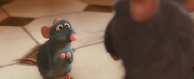
A high angle shot shows the subject from above so the camera is angled down, the desired effect of this angle is to often diminish the subject so they look smaller, insignificant or submissive. In this image the high angle is coupled with an over the shoulder shot to make Remy the rat from the film Ratatouille look insignificant to his father; like he is in trouble.

LOW ANGLE

A low angle shot shows the subject from below, so the camera is tilted upwards to look at the subject. It is often used to make the subject look bigger or taller so they seem more dominant, important, intimidating or in control. This image is from the same scene as above from the film Ratatouille where Remy is looking up at his father, this gives his father greater presence in the scene hence He is important.
CANTED/TILTED
This angle is also known as a Dutch Tilt (used a lot in German films of the 1930/40s), where the camera angle is deliberately slanted to one side, this is used for dramatic effect to show unease, desperate action or madness. It can be combined with panning or zooming for an interesting effect on the audience. 
 
TILT
 
moving the camera lens up or down while keeping its horizontal axis constant, tilting is less common than panning as humans look horizontally more than vertically. It could be used to create suspense.
ZOOM

 A ZOOM is the change of the focal lens to make the subject/object 
 look closer, it is a smooth movement from long shot to close up. This could be used to put emphasis on something like a facial expression.

REVERSE ZOOM


This is the opposite of zoom where the focal lens goes from a close up to a long shot, this could be used to make a character seem less important or most commonly to portray a character In relation to its surroundings.  
 
PANNING
 
Panning is where the camera horizontally sweeps across the scene it could be used to show motion, as a panoramic effect or to build suspense. It can often be combined with a zoom or reverse zoom so put emphasis on a subject. I always remember panning from this image of the BBC1 comedy MIRANDA where the episode in question was called 'it was panning'.


Thursday 26 September 2013

General media terminology- Camera Shots


If you're studying media I really hope you find this helpful.
Camera shots play a really important part in the production and recieval of a film or tv programme, they can emphasise a certain moment, make the characters emotions more prominent and add action to a scene.
so here you go ....

ESTABLISHING SHOT
The first shot of a new scene, to show the audience where the action is taking place. It is often an extreme wide shot, for example in this shot from Lord Of The Rings The Return Of The King, the new scene is where Gandalf arrives at Minas Tirith ( the white building to normal people)
MASTER SHOT
 
is a long take of an entire dramatized scene from start to finish
For example in Taylor Swift's video of We are never getting back together, the enitre video was shot in one take o make it flow.
CLOSE UP

the subject framed by the camera fills the screen, the background is not clear but the audience can see the details of the subject. This angle could create intimacy, stress the importance of the character/event or create suspense, if the shot is of a persons face it is usually at eye level which can be either intimidating or emotional. For example in this shot of the joker from The Dark Night the close up is used to create a focus on that character so we can see direct emotion so the audience can make judgements on that characters personality, here the close up makes the character look intimidating and scary.


MID SHOT
This shot frames a character from the waist/hips/knees up or down, you can see the majority of the characters facial and bodily details yet it is sufficiently distanced to see surroundings. In this example shrek is walking away after causing terror at a village, the mid shot allows us to see that he has a smug look on his face but also the citizens running away from him, therefore the audience can get a universal picture of the scene.


LONG SHOT

Here the camera is shot from a long distance so we can see the full object/human and its entire surroundings. In this example from Harry Potter and the Deathly Hallows part 2 we can see the characters in relation to their surroundings however we cannot see the direct facial emotions, this shot allows the audience to understand whats going on the bigger picture due to more background details being seen, in this case you can see more rubble and dead bodies than you would with a close up.

TWO SHOT
Example of a "two-shot" from the movie Star Trek.
 
 
This shot is the view of two people/subjects but do not have to be next to each other, it establishes the relationship between two characters, they often occupy an equal amount of status in the frame hence they have the same status. In this case the two shot is of the two main characters of Spock and Captain Kirk from STAR TREK having a discussion, it shows that they have equal input and the audience can focus on both of them.

AERIAL SHOT  

This is a high up shot of a subject, sometimes the shot is used to display a vast number of characters to emphasise a universal effect, or it could be used to put a character in the minority. This shot is often used as the point of view of an aeroplane or helicopter, the camera is sometimes strapped to a helicopter or put on a camera crane for this particular shot. For example in this shot from World War Z you can see all the action of this scene from medium angle aerial shot, the subjects are the zombies and as their are lots of them the shot needs to be aerial to capture the vast numbers, this makes the shot intimidating and adds fear.

POINT OF VIEW SHOT  

A point of view shot is shot from the subjects perspective, so we can see what he/she is seeing, this makes the audience feel a personal connection with the subject and they can directly see what the subject is seeing. For example this shot from Silence of the Lambs shows the point of view of Doctor Hannibal Lector looking out of his cell at Clarice Starling, the blurred bars also signify that this is a POV shot.

OVER THE SHOULDER SHOT
It is framed behind the person looking at the subject, the subject often takes up 2/3 of the frame. It can be used to put direct focus on a subject from another persons perspective. This shot is from the film Alice in Wonderland and it is used to make the queen of hearts look intimidating as she fills a lot of the frame and is looking down at the person (well, frog)
looking at her
 

Wednesday 25 September 2013

In depth school magazine analysis (good example)

Here I will be looking at a different school magazine, because lets be honest the previous one wasn't really that brilliant
Here is the magazine for the Fearne Community sports college, which is hopefully more of a joy to look at than the previous cover I analysised, to make it easier to understand this post you should read my post about magazine codes and conventions.
The MASTHEAD is interesting because the font is bold and large meaning the audience can read it with ease, also the location of it is useful as it is in a persons direct eyeline. This paticular magazine uses SECONDARY LEADS to engage the reader and to inform them on the articles inside encorporating TAGS to attract the reader. This cover puts the MENU on the front page to allow the reader to want to read whats  inside without opening the magazine because it provides concise infomation, the menu is located in front of a BOX OUT to make the text stand out due to colour contrast.

The layout also links to the fact that it is a school magazine as it is simple therefore ot is comfortable to read so the wide audience range can understand it. The font and text are very suitable for the magazine as it is clear, legible and dynamic which keeps the magazine current and fun, the different text sizes also adds interest.

The photo links with the main HEADLINE as they both portray infomation about sports, this ensures the magazine cover is not disjointed. The image also is a MEDIUM CLOSE UP so you can see most of the subject and some of the background which allows you to see the full situation, therefore adding interest.

For this magazine the audience has certain expectations, for example because it is a school we expect the articles to be about the school or of achievements of the students. Also because the school is a specialist sports college the readers expect some articles to be sports based to keep in theme with the school.

Monday 23 September 2013

In depth SCHOOL magazine analysis

This analysis will be slightly similar to the previous one about EMPIRE magazine, only it will be about a school magazine instead. I have used the December 2009 edition of the BBS TIMES (Burton Borough school being in Telford ).


Here, the masthead is at the top of the page to catch the readers direct eye line , the font however is not as effective as it is 'times new roman' so it makes the cover way too formal for the suited purpose to attract younger readers.

Also the colour scheme is very dull as the simple black and white makes it look too bland which will lead to people ignoring the magazine, the taglines and text need a coloured box out to make the text stand out and to give the layout more dimension, speaking of layout, why the hell did the person who made this think this layout  would be unique or interesting whatsoever I don't know, the layout makes it look like some sort of wannabe executive broadsheet newspaper which they have cleverly (cough) linked to the title (the BBS times) where they have obviously not bothered to come up with something different or unique of their own.

 I will definitely not be adopting any conventions or techniques from this magazine for my own school magazine because it does not look professional or interesting and will definitely put people off reading it.
Rant over.

Saturday 21 September 2013

In depth magazine analysis


Hello again :)

As I hope to make a magazine I need to analysise a current magazine cover in depth explaining the codes and conventions used and the effect on the audience they have.Here I am going to deconstruct the cover of the February 2013 edition of EMPIRE magazine,
First of all the Masthead is very clear and bold with a font that stands out and catches the readers eye, the clean lines of the font links to the fact that the magazine is about science fiction which has futuristic connotations. The colour of the text is a mix of red and white which strongly contrast, so the important words (in white) stand out, so the main Headline (STAR TREK) is one of the first things the reader see's.

The magazine also uses Tags to catch the readers attention and to preview what's inside, and a Secondary lead to the top left informs the reader of the second most important article inside, this secondary lead also incorporates a Box out which is designed to make whatever text placed upon is stand out more. The magazine also uses a very striking image which is stretched across the background, the medium close up used still allows the facial details to be seen, hence the audience can see the emotion of the character but also the background which adds to even more colour contrast, the image is a symbolic code as it allows the audience to see more emotions and interpret the image for their own.

In my opinion this magazine cover is truly epic and lives up to its expectations, I will strongly consider adopting a similar layout for my school magazine (though perhaps not with Benedict Cumberbatch on the front). The cover is really attractive,striking an any film nerd would be proud to own it.

The magazine lives up to its expectations of being a popular film magazine by having an important sci-fi film as its main feature, this is the same for every cover of theirs, this in turn keeps the reader up to date with the latest films in modern pop culture.

Thursday 19 September 2013

Test screenings


Sorry to say but this isn't anything to do with magazines,

TEST SCREENINGS

-Is a preview of a movie or TV show before its release in order to achieve an audience reaction, the audience is selected from a cross section of the population
-They are usually asked to complete a questionnaire , questions often include what they most liked/least, when the got confused, if their were any areas of concern such as score/narrative/characters, these could be in the form of multiple choice or an answer space

This affects the media ....

because feedback may be used to alter the movie before it's release, this could be
-title change
-small scene change
-an entirely different ending
-a change to the score

For example....

changes were made to the film TITANIC


The length of TITANIC was shortened due to a fight scene being to long for the audience, it's hard to believe that Titanic could have possibly been longer !!!!
 
 
Also the 1989 bond movie LICENCE TO KILL was changed
 
The title was changed from LICENCE REVOKED, as the audience thought it sounded like a drivers licence term
 

Wednesday 18 September 2013

What to include in my magazine (layout)

Wow, more than one post in a day, I'm on a roll here

Layout is a very important factor in the production of a magazine because the information and images needs to be displayed in such a way that it is both informative and eye-catching but not too cluttered, so the masthead, headline and other text stay clear and professional, the general basic layout for a magazine is the main image occupies the middle or background and the masthead it located at the top.
Here are a few examples of different layouts of previous magazines:

 
For example, I like the layout of this particular cover of EMPIRE magazine because the layout is in a simple structure, the Masthead, headline and taglines are all of the same colour to keep everything linked together. Also the main image is the highlight of the cover because it is a medium close up you can see all of the fine detail and characters emotions, the image is also slightly in front of the masthead, giving it an almost 3D effect to engage the audience

 
I also like the style of layout because of the varied fonts which add interest and the simple red and white colour scheme which really stands out against the central image, the fonts are also very elegant which makes a link to the magazines genre of fashion. The overall layout is interesting as the different taglines are not specific to one area of the page which adds more interest, also the picture slightly over laps the masthead which brings the image more into the foreground to be the main focal point.  
 
This magazines layout could also feature in my school magazine as I like the use of multiple images to add detail and even more information, I am also keen on the way they are used to create patterns, in this case flowers, to make the cover unique to anything else on the shelves. I also like the strong use of colour, and it is the most eye-catching magazine I have analysed, also the layout is different because small secondary pieces of information are scattered all across the page both in front of and behind images to add different layers and levels of text. 
 
Because it's a school magazine the cover needs to include lots of information and previews to what's inside, this means that I cant use a minimal cover where the image does all the talking, at the end of the day the magazine still needs to be factual.
.
 

What to include in my magazine (font)


In this post I will be discussing what to include in my magazine and if certain elements could be changed or not
The font of a magazine can strongly affect its overall layout and message, because fonts come in many shapes and styles to suit the type of magazine, for example:

-a business magazines font would be straight and formal, linking to the topic of the magazine, something like TAHOMA font

-while a children's magazine has to have a font which is fun and exiting, but also can be easy to read for younger children, such as SNAP ICT

For my magazine I need to test out and decide on one or more particular fonts

 
Lets just say I'm going to call my magazine, 'THE ACADEMY OF AWESOME' (sadly not for the real magazine)

-For this font I have used harlow solid italic


THE ACADEMY OF AWESOME

I like the free hand approach to the font as it seems fun and informal, thus making the magazine more interesting. However it is very illegible so people might ignore it due to its lack of clarity. Overall the font doesn’t scream ‘school magazine’, more like ‘retro American diner’, so it’s not suitable for my magazine

-For this next font I have used Calisto MT
  
THE ACADEMY OF AWESOME
I like the structure of the font as it is clear, straight to the point and easy to read, however the overall appearance is too executive and might make the reader lose interest because of it's dull format, it should be suited to a factual magazine about law; not something to inform and attract a wide range of people, primarily students, therefore it wont be suitable for my magazine
 
 
- For this next font I have used is Kristen ITC
 

THE ACADEMY OF AWESOME
 
I really like this font as it is quite playful and cheerful but still easy to read, it also is very bold and because of it's curved structure, a wide range of colours can be applied to it. Therefore I might consider this for my title font, where I could edit it on word art to add more layers of colour or to make it 3D so it stands out even more.


Magazine codes and conventions

All magazines should follow basic codes and conventions to be successful.

What are codes? Codes are signs, which often include a meaning, they can also be split into two main sectors
 
.Technical codes are all the ways in which equipment is used to tell the story in a media text, for example the camera work in a film.
.Symbolic codes shows what is beneath the surface of what we see. For example, a character's actions portray how they are feeling.

What are conventions?
Conventions are the accepted ways of doing something. There are general conventions in any medium,  but conventions are also genre specific.

Masthead: as it is the title block for the magazine it should be the most eye catching and interesting
Secondary lead: this is a preview of an inside article usually in the form of a picture
Sidebar: an additional box next to the main feature
Strapline: subheading below the masthead
Pugs:  to catch the readers eye, it's placed in the top left and right hand corner; the prices, logo and issue number are placed here
Menu: the list of contents inside the paper
Tag: this engages the reader into  story by using a word or phrase, e.g. new, exclusive etc.
Box out:  a coloured  box behind text to make it stand out
Caption: text underneath an image to explain it
Feature: usually with a human interest angle presented as a spread
Headline: the main statement to describe the main story

-Also, the text needs to be legible and easy to understand due to the wide age range of a school magazines target market

-The photos need to strongly link with the headlines, subhead lines and captions to make the magazine a collective piece which isn't disjointed, the photos could also be portrayed using a range of camera shots, such a medium close up or a longshot

-The layout is also very important as it needs to be comfortable to read, interesting and engaging

-A contents page is vital as it informs the reader about what is on each page so they can quickly turn to it, therefore it needs to be concise


These are just general features that all magazines should be based around and they can all be altered to suit the type of magazine.

bye :)


Sunday 15 September 2013

Learning camera angles

Hey,

in media studies (study of media, what ever takes your fancy), camera angles are really important as they convey the directors ideas and information about the setting or character to the audience, hence it creates drama through visual conventions (ooooh how very technical), camera angles are a key talking point for your exam and should not be ignored, you can really go to town with describing a certain camera angle and how it portrays the character, links to the narrative and affects the audience.

There are about 13 main camera angles you need to remember, so to help me remember I have created a 'Media Bible', it will almost act as my bible throughout the course, I have only just started making it, so it's not completely perfected. Basically I write key terms and definitions inside it (the notebook I mean, nothing fancy like the matrix or something), I have started with camera angles as they are not only important but I want to learn them off by heart (this is beginning to sound like something I would do for a language exam revision, but hopefully not as painful). To help me remember the angles I have stuck images of angles from some of my favourite films; such as Harry Potter, The Dark Night and Star Trek, next to the definitions. Here are some of them (can I just say, my handwriting is awful so I apologise)


Thursday 12 September 2013

The preliminary task, duh duh duuhhhhh

So, now the akward first post is over, i'm actually going to blog about serious stuff , our first set task is to develop a front cover and contents page for the school magazine as prep for our final music magazine (how very exiting), here I have done a rough sketch and notes outlining my basic ideas (always start off small,  you will have pleanty of time to finalise your plans later), to keep in theme with the school I have used the famous school oak tree as part of my design; just to basically add interest and a bit of colour. Don't lie, when you think of a school magazine something really boring springs to mind usually, I will try to make it as exiting as possible not only to keep you   entertained but myself as well, as A-Levels can make me pretty prone to a crisis every few days  
So bye for now, and i will see you soon     (What am I talking about, seriously)

Wednesday 11 September 2013

Wow, first post, better not mess this up.................

Hi, there :)

This blank space your suppose to write something in is kind of intimidating, therefore I must fill it with stuff someone will hopefully read (please).   By the way I'm Erin, a year 12 student studying media, and as you have hopefully guessed by the title; this is a blog about media (I'm probably going to say 'media' a lot. Sorry), and my epic journey from novice to expert, battling my way through coursework, conquering exams and blogging about it at the same time, (I made that sound a bit too epic then. Didn't I)

So, now down to serious business, this blog is going to be a way of portraying my coursework, on-going production of it and some little skits and fun things dotted around occasionally

Well, there you have it; my first post, I will be posting more soon, so keep your eyes peeled (never liked that phrase, oh well)
 sooooo yeah, ermmmm, this is the awkward bit where I have to go now isn't it,
ok, bye :)